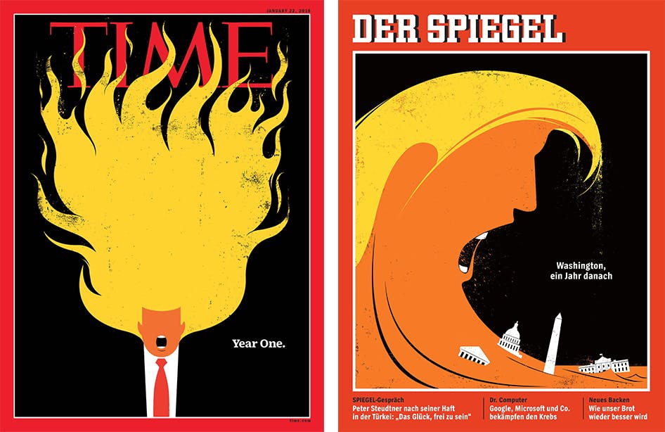
For better or worse, Donald Trump’s presidency has caused an explosion of creativity. But although it has inspired countless images, few are more recognisable than Edel Rodriguez’s illustrations for Time Magazine and Der Spiegel. In this article Rodriguez explains how he invented a visual language to confront what he sees as a “new fascism”.
In August 2016, Donald Trump’s presidential campaign was in crisis due to a series of scandals and controversies. Time hired Rodriguez to create what would be the first of his iconic covers featuring Trump.
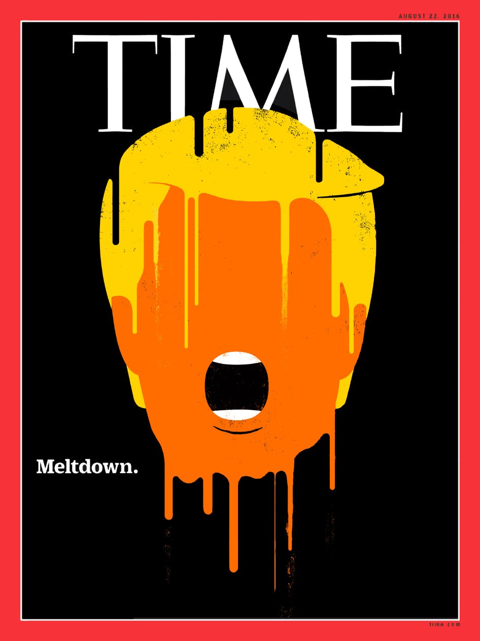
"The editors of Time had come up with the headline "Meltdown." and wanted to create a portrait of Trump melting away on the cover. I had worked on many covers with TIME's art director, D.W. Pine, so he was familiar with my previous work showing faces melting, bleeding, or covered in oil. I had worked with a similar technique on a portrait of Gaddafi for Newsweek magazine after he was killed."
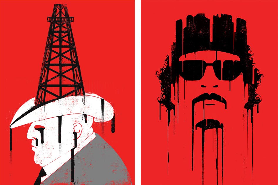
Two examples of Rodriguez's previous work.
Rodriguez explored several directions before settling on the final composition.
“I sketched out a few rough ideas in pencil, and then created a set of digital color sketches which I sent to the magazine. I worked on it for a couple of days, a mix of painted and digital work.”
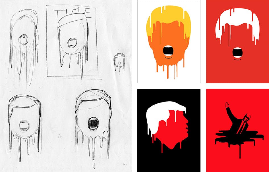
Early conceptual sketches for the "Meltdown" cover.
"The concept was not that complicated, but the trick was making it work. You can do a face that has a bunch of details, but I really wanted it to just focus on his mouth. It was all about him screaming. That's really what gets him into trouble all the time is that he can't stop talking."
Rather than looking at photos of Trump, Rodriguez created the image from memory.
“I don’t really look at pictures of him, it’s all just symbols and graphics in my head. Part of the reason there are no visual cues is that I don’t want to draw his eyes and his nose. How could you just sit there and render his face? I just can’t do it. I won’t do it.”
The final cover was hugely successful, but there was some controversy that Time magazine had chosen to make such a strong statement against a particular candidate.
“I actually thought it would never be published. It was the middle of the election and there’s always a sense that the media should be neutral around the time of an election. But Trump had gone so far and said so many awful things that Time really wanted to show what was going on. I started hearing that it was published on the internet and I was like “Oh wow, they published it!”. I hadn’t heard back from the art director.”
Another of Rodriguez’s most iconic images was a response to Trump’s executive order banning Muslims from entering the United States.
“In 2017 the Muslim ban happened. You had planes trying to land, there were kids that were at the airport and couldn’t get out because they didn’t have the permit to come into the country. I was disgusted by it, because to me that’s something a dictator would do. That’s how Castro and the communists in Cuba treated us.”
Trump’s treatment of immigrants was particularly upsetting to Rodriguez, who received a very different reception when he arrived in 1980 as a nine year old refugee fleeing Cuba.
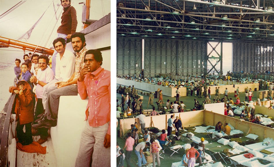
Left: Edel Rodriguez flees Cuba with his family during the Mariel Boatlift. Right: Refugees temporarily housed in hangars at a Florida Keys airbase, 1980.
“At that time I was welcomed with open arms. We were put into a refugee centre where we were fed and given clothes and lots of toys. I remember that — there were piles and piles of toys that were donated, soda, food, all sorts of things. That’s the thing I remember the most is how everything was just gleaming, everything was bright and there was so much of everything. So Trump’s actions made me think ‘What’s happened to my country?’”
Furious at what was happening, Rodriguez created an illustration featuring Trump beheading the statue of liberty and circulated it on social media.
“A few years before this I had created an illustration of an ISIS terrorist. So out of anger I took the ISIS terrorist and I just put Trump’s head on it. I was making a direct correlation that the real terrorist was Donald Trump.”
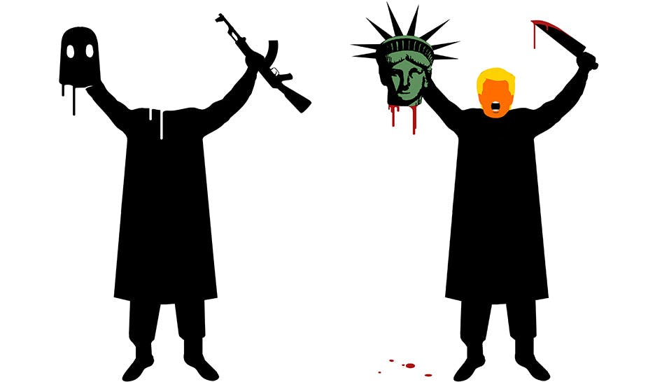
Left: Rodriguez's original illustration of an ISIS terrorist. Right: The updated version featuring Donald Trump.
Rodriguez used the Statue of Liberty to symbolise the damage being done to the reputation and ideals of the US.
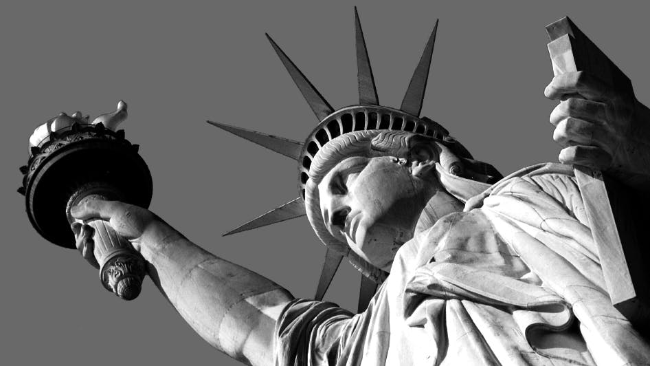
“The statue of liberty was something that we always talked about in my family. When I came to New York it was the first thing I wanted to see. It was like a saint … it was America, you know? So I was working with something that meant a lot to me.”
The image spread like wildfire and quickly attracted the attention of Der Spiegel, one of the most widely read magazines in Europe.
“All of a sudden the art director from Der Spiegel calls me and says ‘We’ve been looking through your Twitter feed and there’s this image…Trump as an ISIS guy…has that been published anywhere?’ And I said ‘No.’ She said ‘Can we publish that?’ and I said ‘Are you guys crazy? You seriously want to publish this on the cover?’ And they were like ‘Yeah, we really like it! But can you change his tunic to Trump’s suit so that it looks more like him?’”
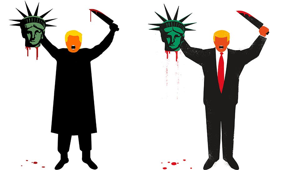
Left: The original image circulated online. Right: The updated image featuring modifications requested by Der Spiegel.
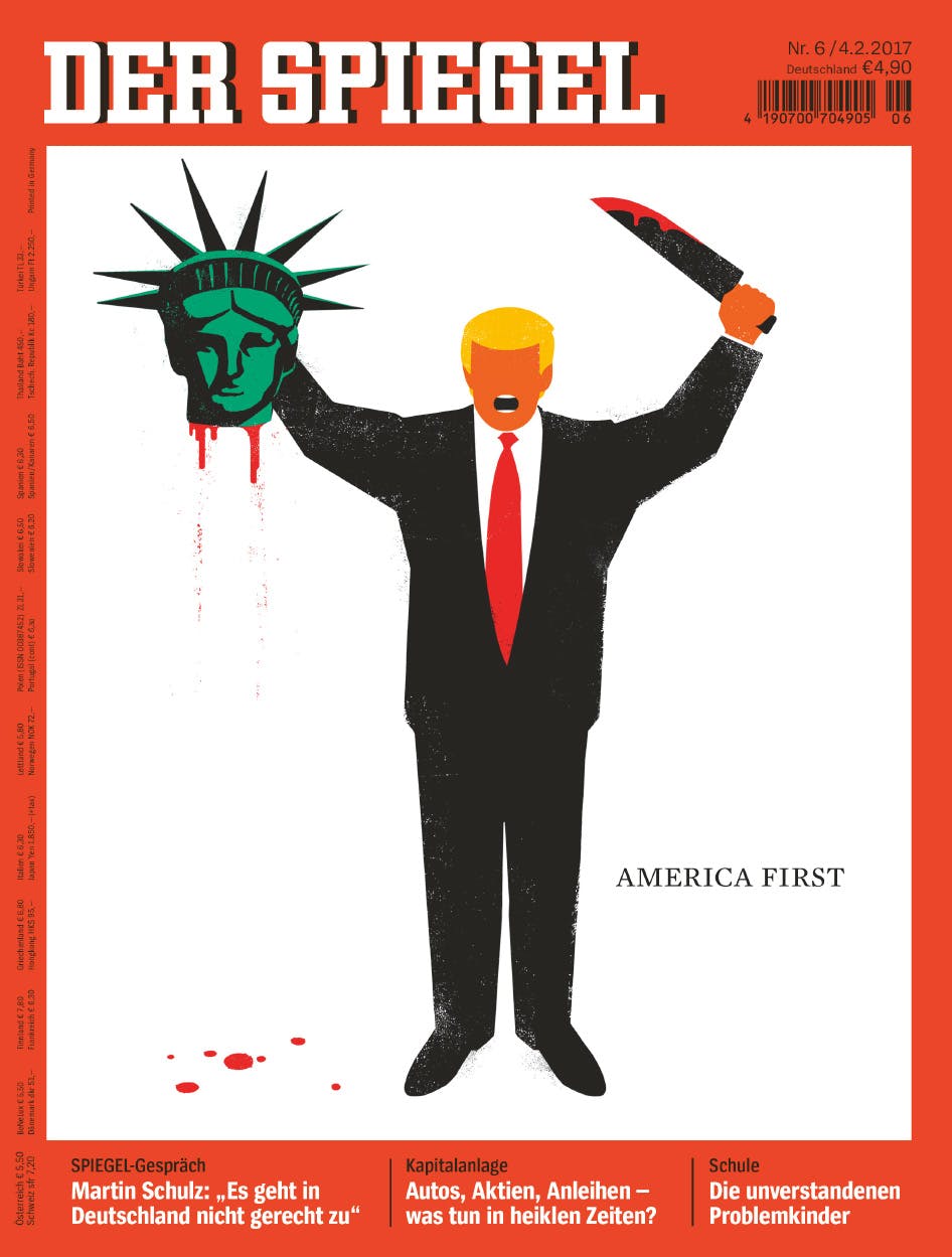
The reaction to the final cover was immediate and intense.
“There was definitely a big reaction — probably the most of any of the images I’ve made. The cover was published on Friday at 6pm, and I received calls from The Washington Post and Buzzfeed within five minutes. The next morning, before the printed cover was even on newsstands, protesters had already downloaded and printed the image as large posters, and brought them to protest the Muslim ban on streets and at airports across the country. It made me glad that people were paying attention to the topic. Perhaps it got across how serious this is that an artist would get to the point where they would make an image like that.”
Other covers for Der Speigel followed. In 2017 Rodriguez was asked to create an image in response to Trump’s implicit support for the actions of Neo-Nazis and Ku Klux Klan members in Charlottesville, Virginia.
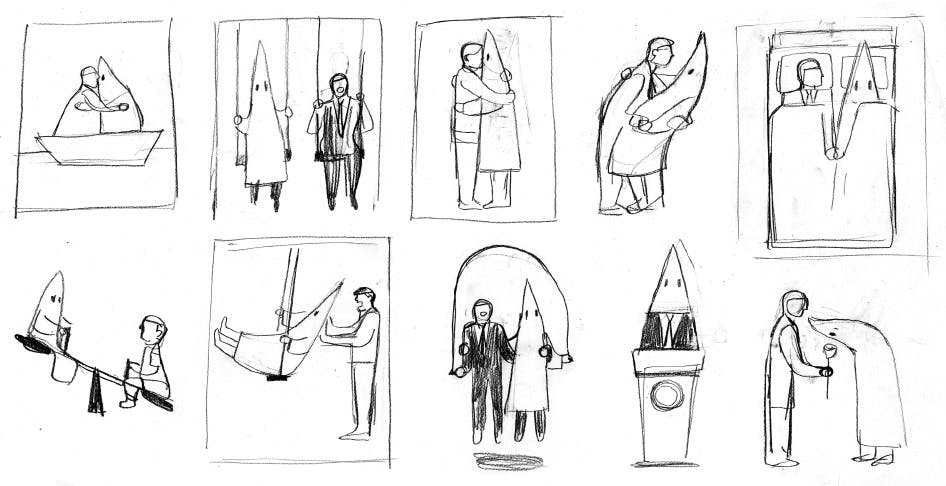
Early pencil sketches for Der Spiegel.
“I had drawn Trump with a KKK hood before, but that imagery had never appeared on a magazine cover, and I wanted to do so in response to these events. I created over a dozen different ideas, both pencil and color sketches and sent them to the editors at Der Spiegel.”

Early conceptual sketches for Der Spiegel.
“The process was very fast actually. I usually only spend ten or fifteen minutes on something I might put on the internet. If it’s a cover then I’ll spend more time tweaking it and things like that — maybe three or four hours.”

"The True Face of Donald Trump" cover for Der Spiegel, 2017.
“We discussed it back and forth and felt that the serious, stark image, of a hooded man with a red tie, seemed to say it all at the time. They published the image with the headline ‘The True Face of Donald Trump’. It seemed fitting at this point in time, to show who I thought he really was to an international audience.”
Rodriguez says that the style of his illustrations is a response to the current media environment.
“I don’t think people look at information the way they used to. They don’t sit down for an hour and say ‘I want to read this 10 page story on what’s happening’ — they’re receiving bits and pieces from the web or from Twitter. So we have to rethink how we communicate ideas to people and how we inform them.”
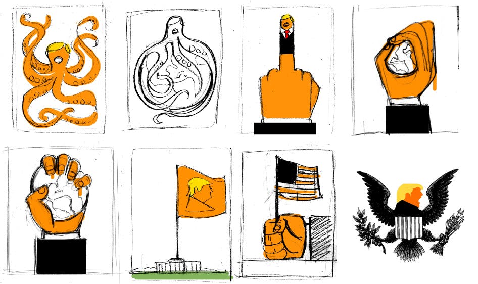
Early conceptual sketches for Der Spiegel.
“I don’t see my work as satire. At first glance it might appear funny but then there’s real deep anger and confrontation behind it. I’m basically trying to get people to understand an idea in two or three seconds. I think the most direct way to do that is to use rich, bold, powerful, colourful imagery to get people’s attention.”
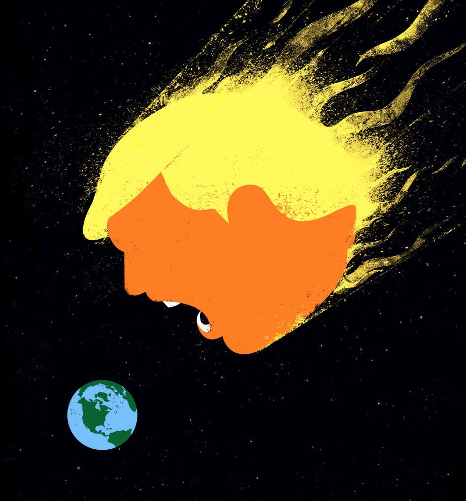
"Das Ende der Welt" cover for Der Spiegel, 2016.
“I wanted that visual strength, and making him orange is a very strong visual. For me it’s not even him anymore. It’s more of an object or a brand. It’s about creating a brand and then doing everything I can to destroy it.”
But despite the success of his images, Rodriguez would rather he didn’t have to make them at all.
“My favourite thing is to just be in my studio painting and making things. I have sketchbooks with a bunch of other things that I’d rather to be painting. But I wake up every day and I say ‘I’ve gotta say something about this’. I think that one way you can oppose this insanity is to meet it with a lot of strength and force and that’s what I try to do with my images. The best advice I’ve received is to not be afraid of a painted surface, to attack the painting instead of backing away. The same advice can be translated into other parts of a creative life.”


