The New Yorker has had an outsized influence on American culture since its launch in 1925. Beyond its legendary long form stories, its unique graphic style has inspired generations of designers.
But with mere days for concepting, design and animation, the process of making its editorial illustrations can be frantic. In this article, Daniel Savage walks us through the creation of an illustration for an article on paper jams.
Daniel normally accepts illustration briefs from his Los Angeles studio, but this time was different.
"The project came to me at the start of a trip to Snowbird, Utah, so most of it was done in transit or at the lodge when I wasn’t waist deep in fresh powder. Nothing beats paying for your trip with a drawing!"
From the ski-lodge Daniel sketched three concepts for his client to choose from.
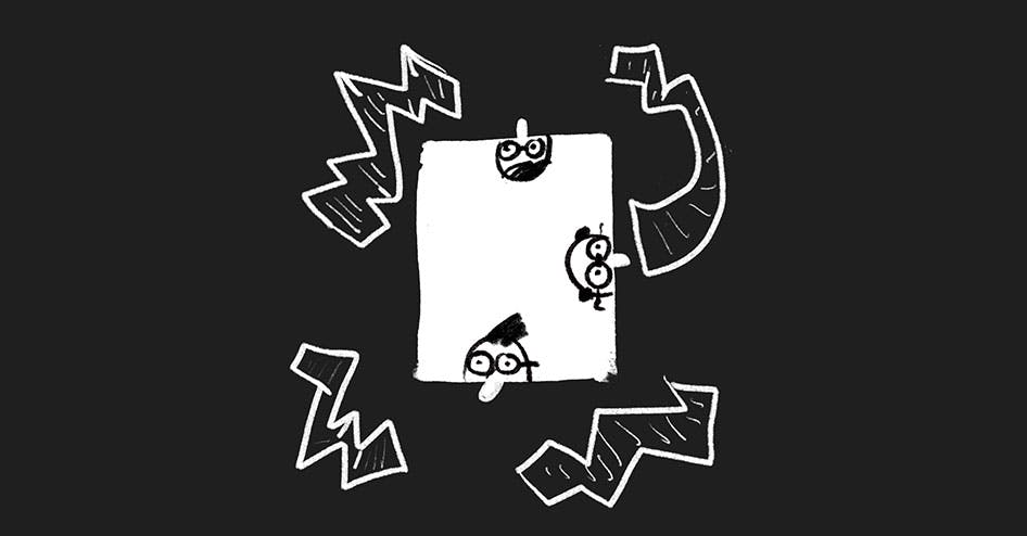
"The first concept was a view from inside the printer. Paper would fly around until they jammed, then the hatch would open up and 3 engineers would poke their head in. This idea would have been fun animated but might not have been as interesting in print."
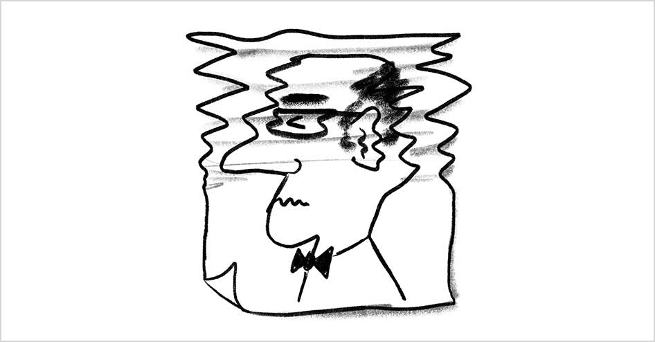
"The second concept was an engineer’s picture printed on a piece of jammed paper. Animated it would have gone from a clean to jammed and his expression would have changed from happy to annoyed. There was an opportunity to actually print this and do some stop motion animation."
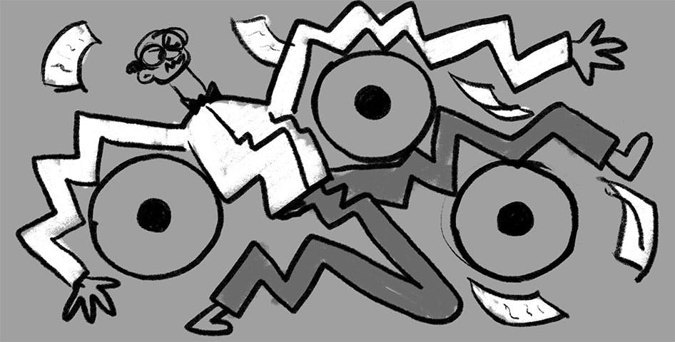
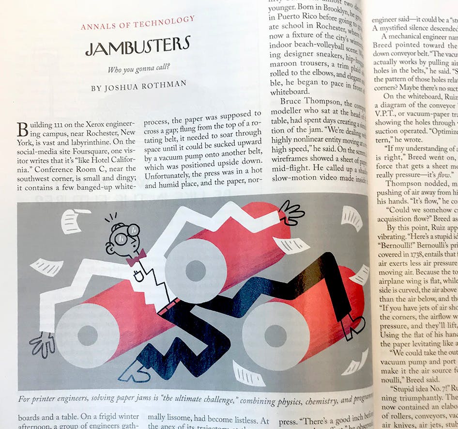
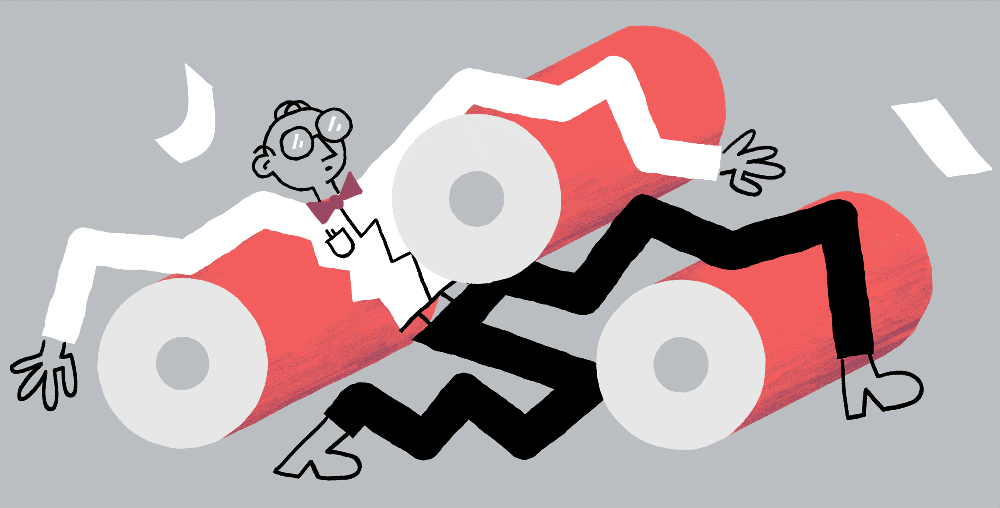
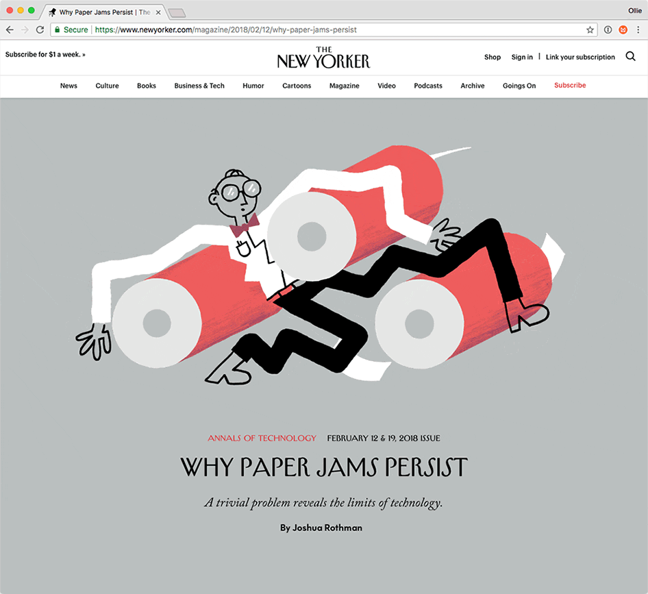
"The third concept was the direction they chose. Pretty obvious conceptually—the engineer is the one jammed in the printer."
With the direction approved, it was time to start sketching.
A time-lapse of Daniel sketching on the iPad
"You have to let the static version take priority. A static image can always be animated in some way, even if it's as simple as a blinking light but it doesn't always work the other way around. Having said that, I do try to keep both in mind while sketching (or at least deciding which sketches to present)."
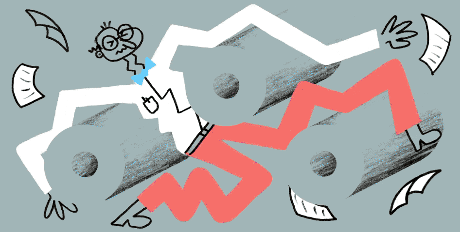
As the illustration took shape, the main character went through some subtle changes.
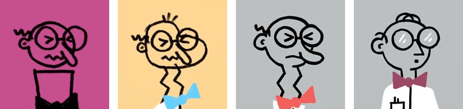
"I was trying to play up the comedy aspect with the face. They liked it but asked for a geometric face so it felt more scientific."
Once the static version was finished, it was time to start animating.
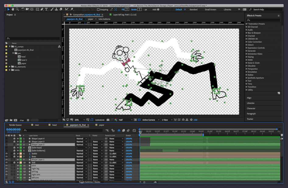
"Originally I was going to have him get sucked in to the printer then pushed back, but found it funnier to make the poses much more exaggerated with quick cuts to each one. This was animated in After Effects which makes it easier to hit the quick editorial deadlines."
With the animation done, the illustration was ready to publish.
"When Aviva Michaelov puts the image full screen front and center on the website it’s pretty powerful. You can’t ignore it! And seeing your work in print is always exciting—it’s nice to be able to touch it."