Warning: this article contains spoilers! Grab Florence from the App Store or Google Play if you want to play it first.
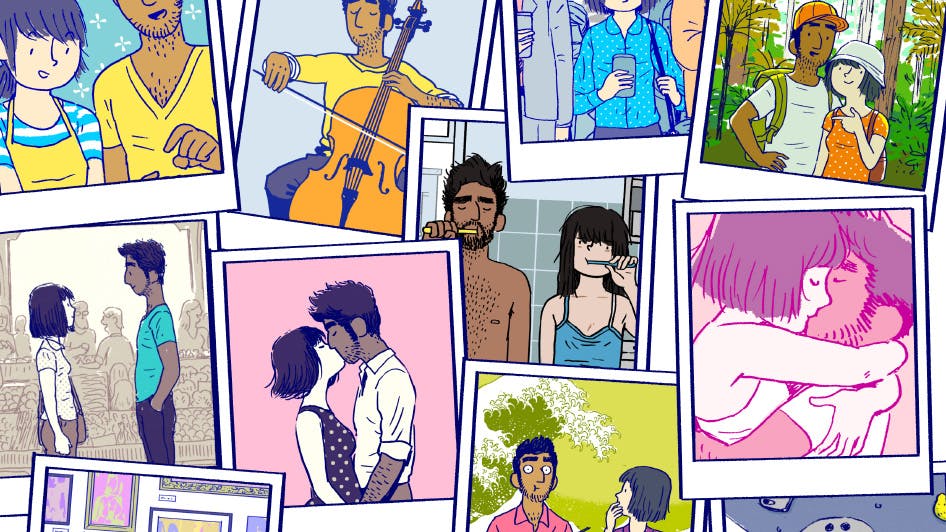
Florence is a game where two people meet, fall in love and eventually drift apart. The game follows 25 year old Florence Yeoh through her daily routines and her relationship with a cellist called Krish.
The game (which was released on Valentine’s Day) has been critically acclaimed, picking up a coveted Apple Design Award—the second for lead designer Ken Wong whose first success came with Monument Valley.
“Because of my previous work on Monument Valley I was able to get the attention of a publisher and they helped fund the project. The idea was to build the team first and then figure out ‘what are we going to make?’—just trusting that we would figure it out. And we did! It was very scary though.”
Simple mini-games advance the narrative over Florence’s 20 short chapters, the majority of which revolve around common social interactions and daily routines. One example is this mini-game which simulates a conversation between the characters.
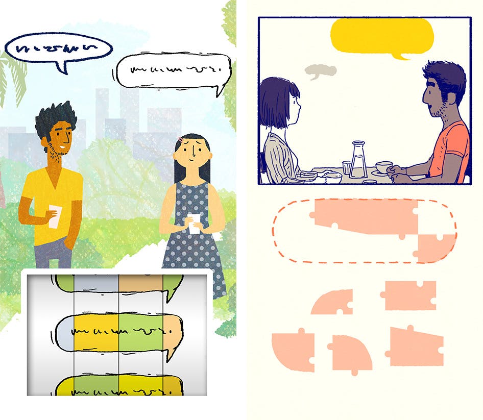
Left: An early image for the 'First Dates' level where the mechanic was colour-matching. Right: the final level in the game featuring jigsaw puzzles instead.
“I think of the mini-games as metaphors. The interaction on the touch screen … how can that make you feel something about the characters? One of the stronger metaphors that is in the final game is when they’re on their first dates and you’re putting the speech bubbles together. People often tell us that’s one of their favourite levels. The idea was that it feels like putting words together, but that as the dates go on and they find it easier to talk to each other, the puzzles become easier and easier.”
Teeth brushing is another recurring mini-game.
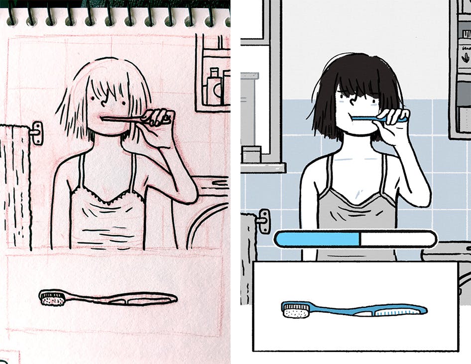
Left: An early sketch of the tooth brushing mini-game. Right: the final artwork in the game.
“Brushing teeth represents the mundanity of every day life. In comics they would call it a “slice of life”, something based on real human lives and real human experiences. It’s not intended to be difficult, the idea is that anybody can get through this and have a nice experience. Later in the game when Krish is in Florence’s life, tooth brushing symbolises that they have fallen into a routine.”
Some of the mini-games changed a lot during development, like this one simulating an argument.
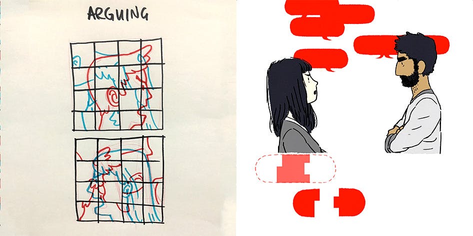
Left: an early idea for a chapter about arguing. Right: the final argument mechanic in the game.
“Originally the idea was that we’d represent an argument with a single puzzle that would start with one of the characters being visible, and you had to rearrange the pieces until the other character was visible. This was a neat idea but likely wouldn’t have captured what it really feels like to have an argument.”
The final game featured represented arguments as increasingly sharp speech bubbles instead.
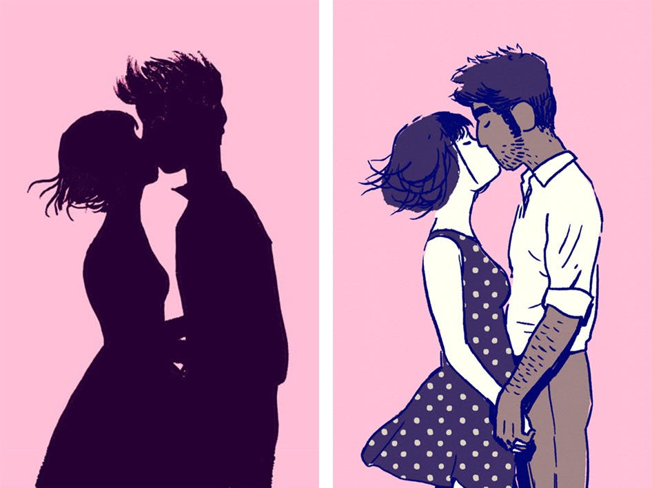
Left: the original sketch for Florence and Krish's first kiss. Right: The final image from the game.
“I try to make games that anyone can play. It sounds like a really simple idea but I think traditional game designers take it for granted … games are actually really hard! I prefer games that are really simple, where you don’t need to learn a bunch of special moves or practice it for 100 hours — you can just get an idea or get a story and then move on with your life. I think people really appreciated that about both Monument Valley and Florence — that they can just get to the end of a game and then tell their friend about it and reflect upon it.”
The art in Florence was all created by hand, giving the game a unique feel.
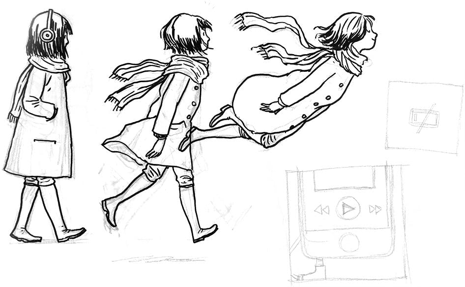
“These sketchbooks, this is how we do the art from the game — it’s partly design, partly the final images for the game. I didn’t want Florence to look like a game. I wanted it to stand out on the App Store as something different and fresh. I would scan these sketches and then modify them in Photoshop.”

“Initially the game had a lot more of this magical realism in it, but we felt the story was stronger when we kept things relatively grounded. This level is the exception, where Krish’s music is so beautiful it lifts Florence off her feet.”
The characters in the game went through several iterations as well.
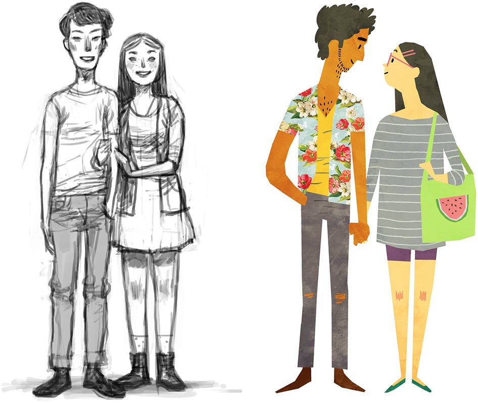
Early digital paintings of the couple.
“We wanted to tell a story about people from different backgrounds. Something that we’re really happy with is that a lot of Asian woman and Indian guys really identify with the characters. A lot of people have written to us and said ‘I’ve never seen myself represented in a game like this before!’”

“This is one of the images that we felt really summed up the spirit of the game. The two characters are looking at each other, happy and comfortable with each other. I feel like they are uncertain of the future, but are very optimistic. The couch actually changes colour depending on what’s happening in the game. At this moment, they are filled with joy, so the couch is yellow. In a game where we tell the story without words, images like this are so important.”
Krish’s design was always fairly consistent, while Florence went through a lot of changes.

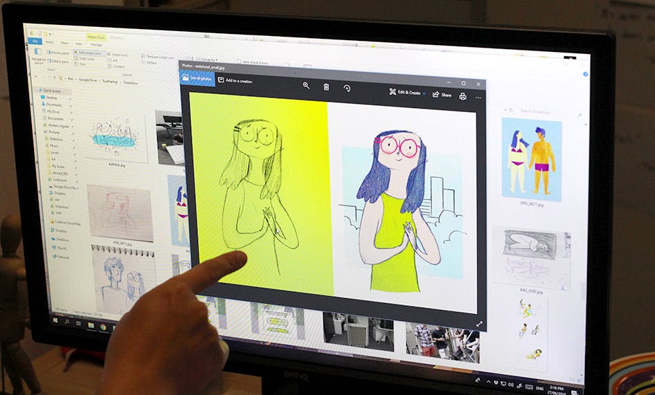
“The original design had glasses. But the problem was that the position of her eyes within the glasses made it look like she was looking in different directions. So that was a hard design to pull off in the end. There was also something about the hairstyle that wasn’t working in earlier versions.”
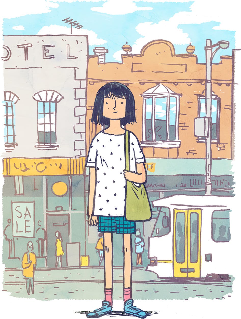
“This is one of the first images of Florence’s final character design. The idea was to kind of convey her personality through her hair — a little bit uncontrollable, kind of messy. To me it said that her life it a little bit messy and a bit hard to keep under control as well.”
Both the artwork and gameplay were designed to show the inner states and emotions of the characters.
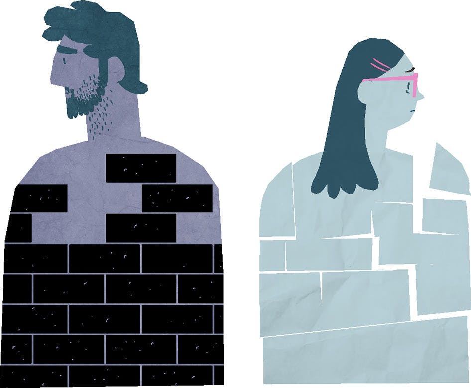
“This image was from an early test level and it was meant to show that the two characters were going through different types of trauma. It felt like Krish was ‘walling up’, while Florence felt like she was breaking apart. Part of the reason this didn’t work is because it was only visual and not interactive.”
Some aspects of this concept were preserved in the “Drifting” chapter in the final game (shown below).
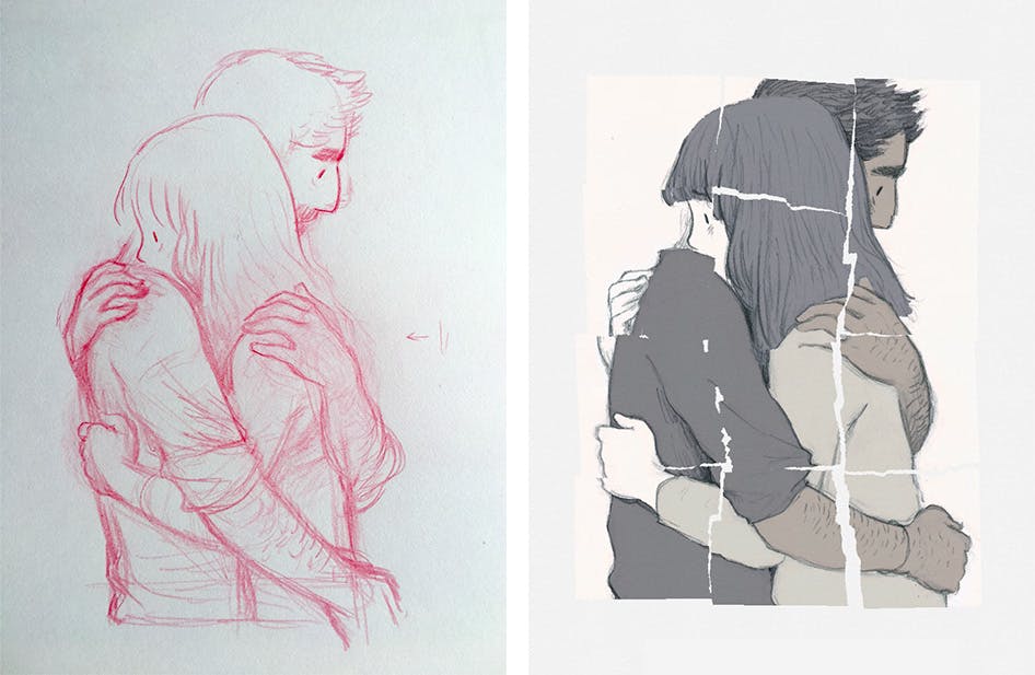
Left: An early sketch of the "Drifting" level. Right: The final artwork in the game.
The team maintained a full storyboard of the game which changed over time as the final narrative emerged.
“We had the whole game up on the wall … that’s a process that we kept up the whole time. As we went along we updated the wall as we iterated and replaced chapters.”
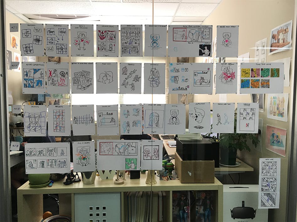
The early version of the storyboard show above featured a chapter called “Reunion” where Florence and Krish meet again many years later. But this idea was absent in the final game.
“Originally it felt like this was their story together. But more and more it became Florence’s story and Krish was just a part of it. It felt like what was most important for Florence was to let go of him in the end — really let go, no comebacks, no second chances. I actually fought really hard against this because I wanted to know ‘What about Krish? Is Krish going to be ok!?’ But really that’s not Florence’s problem any more. You don’t always have to have that traditional happy ending.”
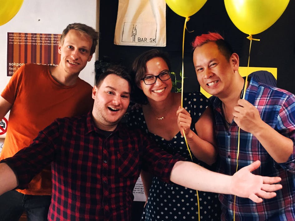
The Florence team. Left to right: Sam Crisp (Programmer), Tony Coculuzzi (Lead Programmer), Kamina Vincent (Producer), Ken Wong (Creative Director).
Florence is available now from the App Store or Google Play.


