Frank Chimero is a designer, illustrator, and author based in New York. His clients range from Nike to NPR and his work has been featured in Monocle, The Atlantic, Time, Slate and The New Yorker.
In this article, Frank takes us through his process of designing a poster, from concept to production. This particular poster was created to promote a lecture Frank gave called “The Eye Knows” about how words and pictures work together in design.
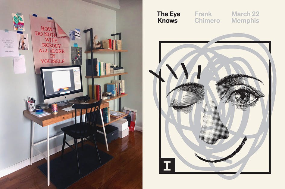
Left: Frank's workspace. Right: the final poster.
Here Frank talks about how he uses his studio space to get inspired.
“The wall above my desk has all kinds of recent discoveries taped up: quotes, postcards, visual references, and print-outs of images I find online. It’s satisfying to rearrange things with my hands to understand them differently.”
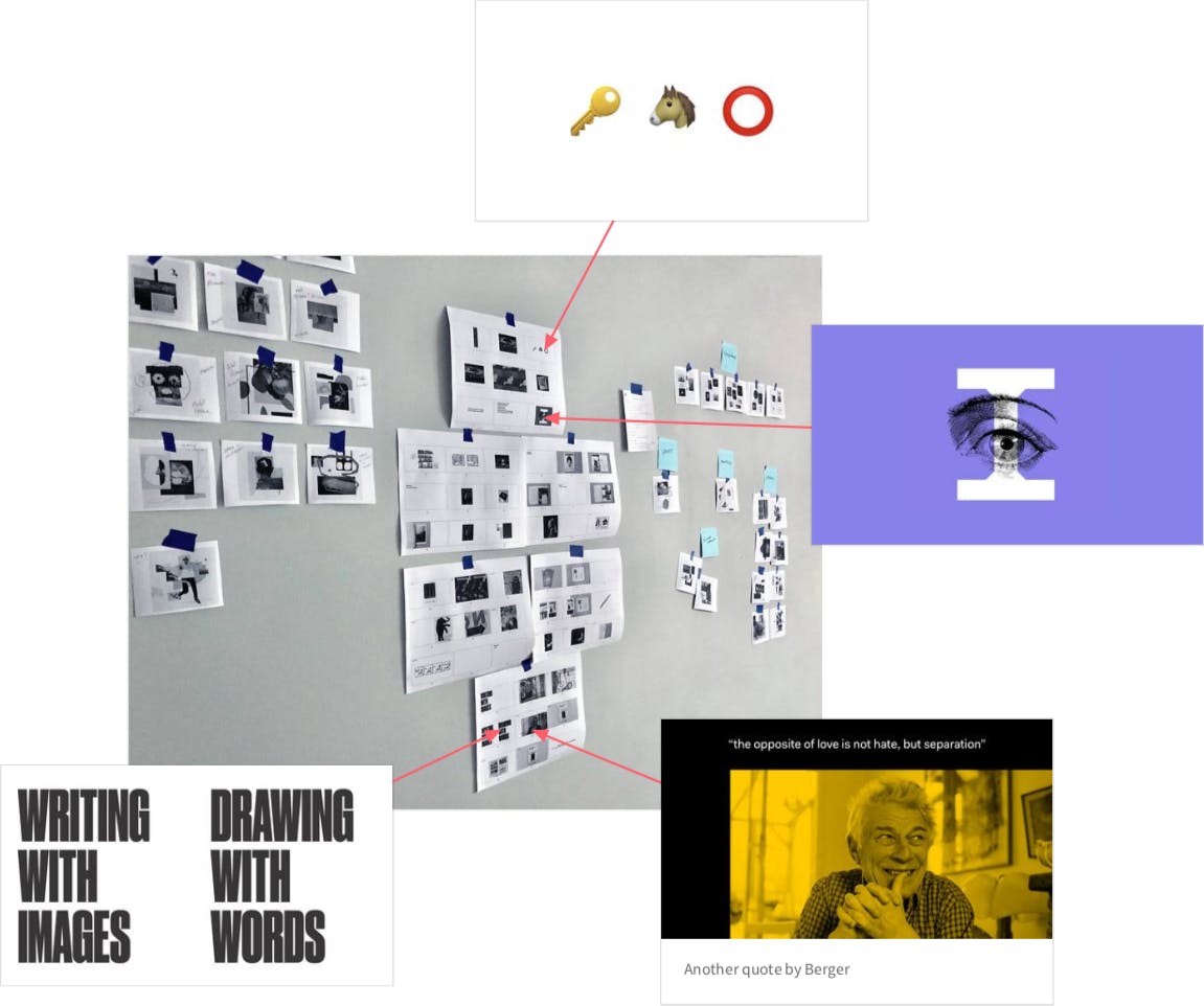
Selected slides from Frank's talk.
The content from the presentation was a natural starting point for the design.
“I printed key slides from my presentation and taped them alongside all the visual inspiration, and eventually stumbled into the poster’s concept by repurposing an image I made weeks earlier for the middle of the deck.”
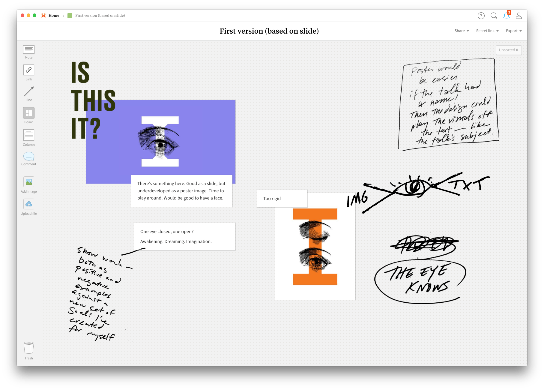
Frank's first concept for the poster in Milanote based on a slide in his presentation.
Frank’s early design featured a single eye, but he soon added other elements to create a complete face. The first addition was a nose inspire by John Baldessari—an American conceptual artist who has produced several works featuring deconstructed faces.
“The nose is Baldessari’s — he’s an influence on a lot of the work I make. I love the tone of his work. I admire the kind of self-reflection and humor he shows is possible with conceptual work without having it get too dour or cerebral.”
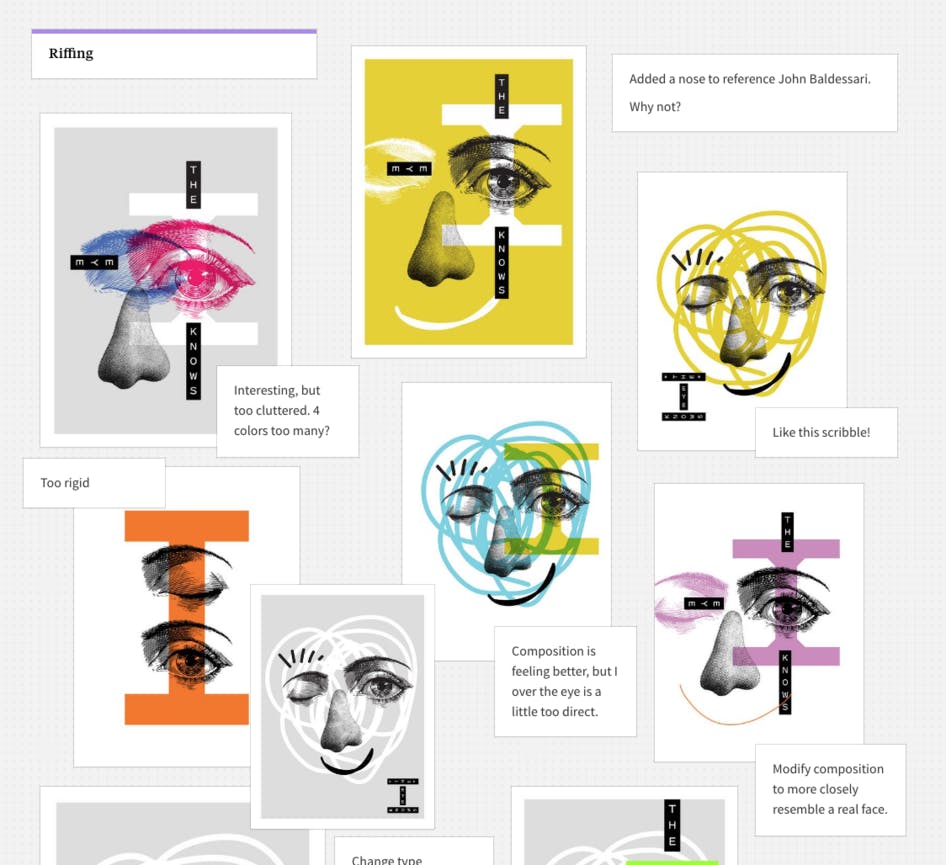
Various early versions of the design.
Then it was time to iterate. For this type of project, Frank likes to finish the design in a single sitting.
“I’m a big proponent of ‘once through, cleanly’. You think about your idea, sketch, then put some glue in your chair and bang it out in one sitting. All of my best work happens this way: posters, collages, essays, outlines for talks, and so on. The work seems to be more cohesive and the energy more concentrated and palpable. If you sit down and what you make is bunk, you walk away, come back later and start over. You don’t keep any of what you’ve done before, you only retain the memory of what went wrong. It’s a silly method, but it works for me.”
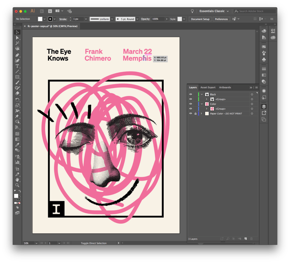
The working file in Illustrator.
As the design came together, the energy of the face began to shine through.
“I forgot how nice it is to work on something and have it look back at you! I’ve done a lot of branding and interface work in the last couple years, which means I’m mostly staring at simple shapes and colored rectangles all day. I love it, but those shapes don’t look back. There’s a face on this poster, and as I continued to refine the design, the potency of the energy it was shooting out became more real, more warm.”

The final design at the printer.
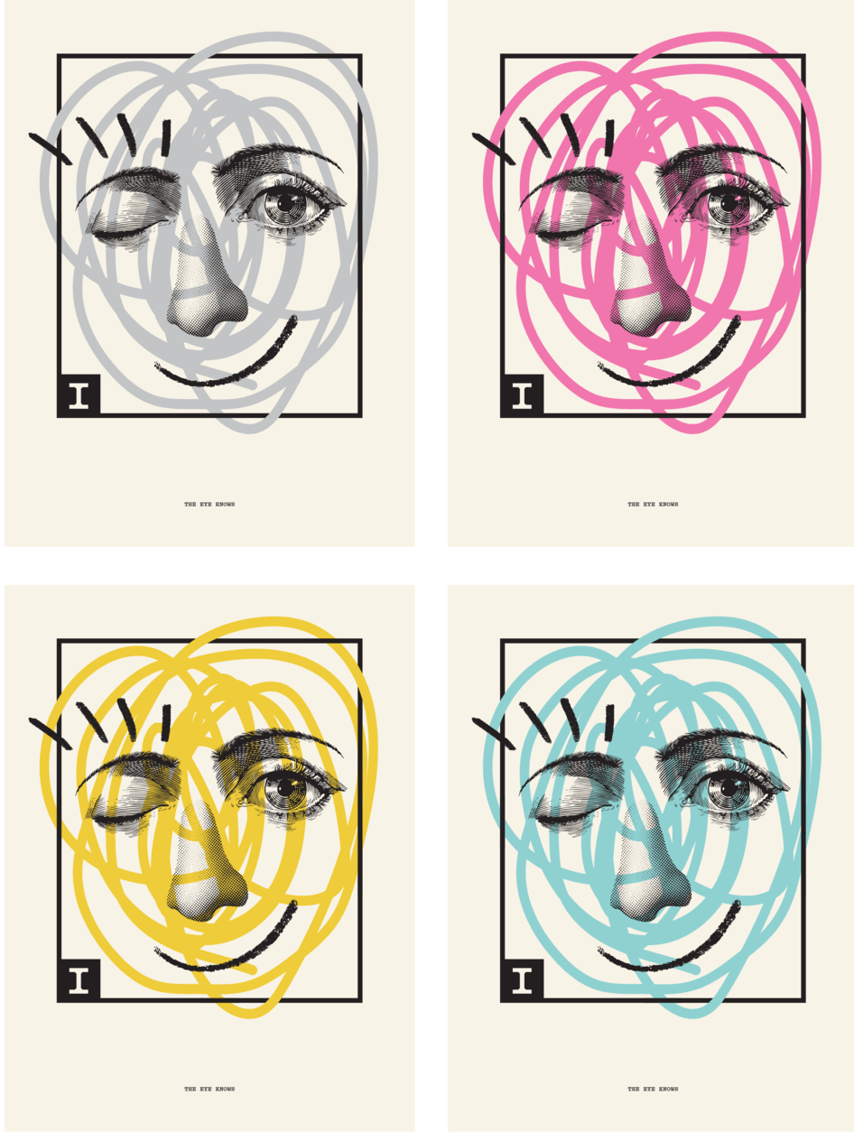
And then the poster was complete.
“I’m still surprised I’m so happy with the outcome. Maybe I can value this design a bit more honestly because it feels like it came from somewhere else. It does a good job of capturing my attitude towards design: affable, intelligent, and clear, expressing some welcome charm.”
